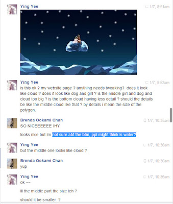
Some questions I have jot down to ask on the alpha test was:
- Does the visuals look like what I want it to be ? (bottom: Cloud, Middle: girl and dog sitting on cloud)
- is the bottom cloud position too high or too low ?
- icon placement
- comment page layout
- upload story layout / design
 |
| mockup visuals used for alpha testing. |
 |
| mockup visuals used for alpha testing. |
 |
| mockup visuals used for alpha testing. |
 |
| mockup visuals used for alpha testing. |
 |
| mockup visuals used for alpha testing. |
 |
| mockup visuals used for alpha testing. |
Peers involved in the alpha testing was Brenda, Sebastian and Xinwei.
Brenda's feedback:
- The bottom cloud look like water.
- Other than that, it looks fine to her.
- The middle visuals look like a girl and a dog to her.
 |
| Brenda's feedback |
 |
| Brenda's feedback |
Xinwei's Feedback:
- The middle visuals look like couple or a bear.
- The bottom cloud look like ice.
Sebastian's feedback:
- The bottom cloud look like ice.
- The middle cloud is ok.
- The middle girl and dog visual looks like teddy bear. Probably make the flower color more vibrant or make the dog ear stand or add a collar to the dog.
- bottom cloud position was suggested to be animated to enhance the user experience. Cloud rise frm below.
- Icon placement: think of the user flow, and was suggested to make a few pages instead of putting everything all in one page.
-Comment page layout: Experiment with different title font
- think about the user flow.
No comments:
Post a Comment